COVID Cases by County in Florida
Are COVID cases rising in your (FL) county?
COVID-19 has been raging through the United States for the greater part of 6 months now, so I’m probably late to the game in developing this, but I still haven’t seen a tool like it. My latest project is a COVID-19 tracking tool that grabs the new cases in each county (FL only, but you can edit it for your state) and tells you whether the cases are falling or rising in your county via an interactive graph. This can be a really useful tool to quickly see how COVID is moving in your case, but it shouldn’t be a replacement for practicing exercises like wearing a mask and social distancing.
The first part of the project utilizes an API to grab the data for each county in Florida and writes it into a .csv file that we can interpret the data from. This was relatively straightforward and I set up a Windows Task to run this everyday to grab the data for me automatically, but that didn’t work out, so I’ve had to run the code manually each day. It only takes a second, but it’s a pain if I forget to do it. However, this has given me pretty accurate data, minus the days where it decided there were 0 new cases in each county. Unfortunately, my data is only as good as the API allows, although I have ideas on how to improve this accuracy.
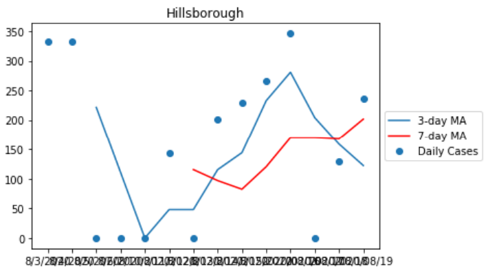
Once we’ve gathered all the data, we gotta do something with it, right? So I started by plotting the new cases per day and plotting a 3-day and 7-day moving average to see how the cases are transitioning. I only ran these two because of the lack of data I have at this point, but ideally I’d like to do a 7-day and 14-day moving average, since the cases can vary massively by day, especially weekends. This led to some interesting data, so let’s look at my county of Hillsborough.

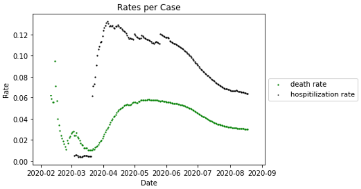
Pretty neat, right? As you can see, over the course of 7-days the number of cases is rising, even though the 3-day average shows it’s falling. Of course, this is due to the 3 days of 0 new cases, where the API failed to add the new cases to the data. I also created a graph that tracked the hospitilization rate and the death rate of COVID over time, shown below. You can see how it hospitilization and death rate rose quickly, but eventually fell and flattened off.

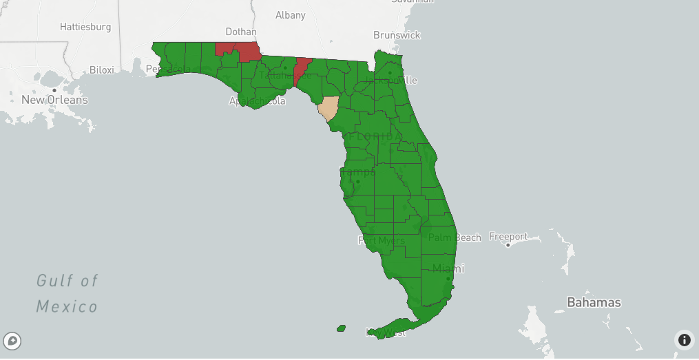
So now that I gathered all the data for a couple weeks, it was time for the difficult part. The longest part of this project was building a map that would show you whether your county was going up or down. Using Plotly and a lot of tutorials, I finally got a map that worked. The following map compares the 3-day moving average of today and 3 days ago to see if cases are in the rise in that specific county. It then colors it red if cases are rising, green if they’re falling, or beige if they are the same. This can give anyone a quick look at a map to see where cases are growing at a county level.

The next step is to make it more interactive and make it shade based on how much cases are growing, as well as adding a 14-day moving average. But for now, I accomplished something worthwhile and hopefully useful. Unfortunately, this site is just static, so I can’t put the whole interactive tool on here. Or I just don’t know how to do it yet. Either way, I hope this is useful. If you want, you can find the code on my github.

Comments