What Beers Taste The Best?
Which beers taste the best?
I’ve drank a lot of beer in my day. According to Untappd, I’ve drank over 700 different beers, which is more than I probably should be proud of. After spending thousands and thousands of dollars on different beers, I started to wonder, does more expensive beer taste better? I originally wanted to compare the price of a beer per ounce to it’s rating, but after many failures, I pivoted and decided to find out which beers are the best. I originally planned to scrape all the prices from totalwine.com and grab their ratings data from beeradvocate.com. I had the code set up, but I was unable to get past totalwine’s anti-bot software, so I settled on just the data from beeradvocate.
Using beeradvocate.com, I was able to get a beer’s brewery, style, abv, and, of course, rating. While this data gives us less insight than looking at the price of the beer, it was still interesting to look at. In the end, I was able to find which brewery and style had the best average ratings. For a look at the code and data visit my github.
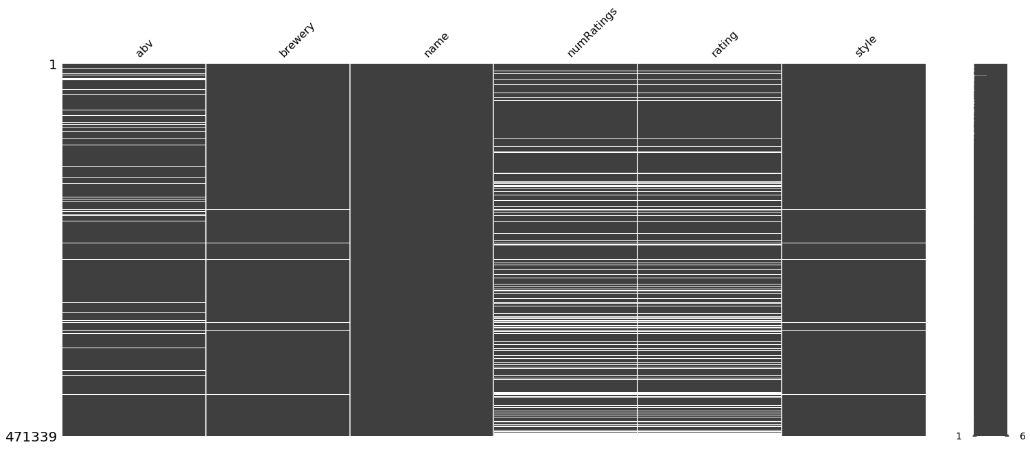
We started out by building a spider using Scrapy to get all the data. After over 24 hours, a computer auto-update, and multiple attempts at webscraping, we finally had all the data. In this case, all the data means 471,339 rows of different beers. Sadly, a lot of these rows had to be removed due to incomplete sets or a low number of reviews. Using the missingno library for python, we were able to see the amount of data that was available.

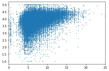
Knowing this, we were able to build a dataframe and clean the missing data using pandas. After removing any missing values and any beers that had under 25 reviews, we ended up with ~100,000 rows left. I chose 25 reviews because it was a significant enough sample to get a picture of the beer and also kept us with a good amount of data to view. When you take the 100,000 different data points and plot the ABV of the beer against it’s rating, you get the graph below.

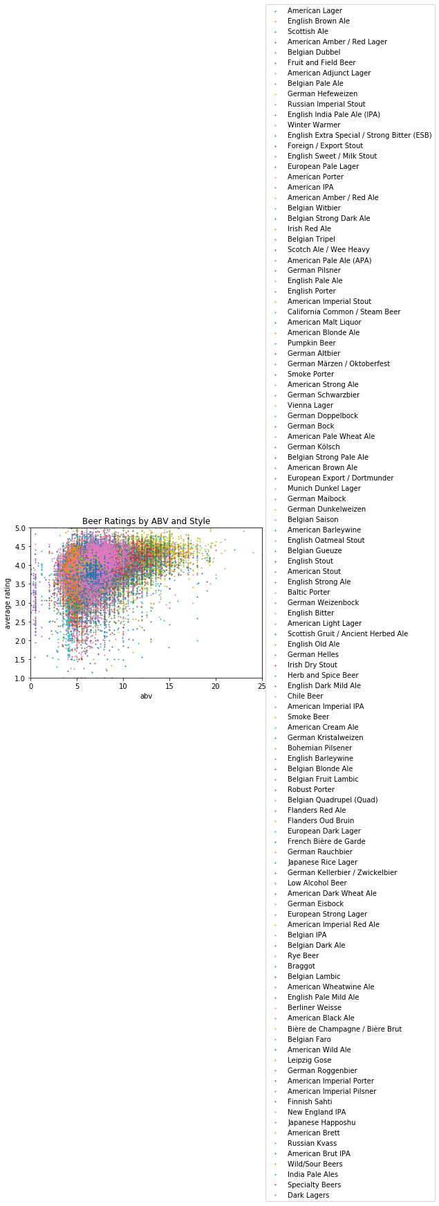
Doesn’t tell us anything, right? So the next goal was to make this look a bit prettier. I decided to use all the data points, but separate them based on the style.

Again, this didn’t produce anything pretty, but it helps you separate the data a bit. Using matplotlib was a bit limiting, because there were 100+ styles and only so many colors to use. It’s also difficult to see which data points belong to which beer style. You could make some inferences, like heavier ABV beers of a certain color are probably imperial stouts, since those are normally heavier beers. But there’s still not much in the data for us to look at. Finally, I decided that we could create a graph for each individual style and brewery, so then we’re able to see data based on these two groups.
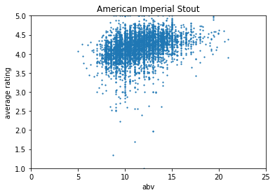
This is still a bit problematic, because there’s over 100 styles and, even worse, over 9000 breweries. So you’ll get over 9000 total graphs. Still, it’s fun to look at for a specific brewery or style, like below.

Here, the data is a little more clear and you can see a trend in the style. Looking through this, I noticed that abv may not have had a huge effect on the rating, but the style of beer definitely did. So I decided to go through the data set and grab the average rating for each brewery and style of beer. This would help us decide which style of beer, on average, was the best. As well as which brewery consistently made the best beer, according to raters. While doing this, I got rid of breweries and styles with less than 5 beers, to get rid of any skewness that can be caused by such a low number of beers.
So what conclusions can we draw from any of this? Well not many really.

Comments